Prototyping & User Experience
To show the prototyping process, we will be using Sketch, if you do not have it yet, you can get a fully featured version 30-day free trial of the software here. Obviously, you can use the software of your choice which propose the same functionalities e.g. Adobe XD.
We will rely on a Salsa Dancing app that will be used to explain the prototyping, User Experience creation and interface designing principles. The app will be developed in Flutter which allow deploying it on both iOS and Android devices. You can learn more about the whole project here.
Thinking about the App Design
Wireframing
The first step we have to make is designing the structure of our app.
Based on the key features we defined in the prototyping phase, we need to sketch out the app key screens and navigation paradigms between them.
For this sample app, we have identified the following key features:
- Present a random list of moves to perform for the user next dance
- Provide a precise description of each move
- The list of random moves can be shuffled
- Self-rate your dance moves
- Display user its progress in a given week
- Display user its achievements
I am using Sketch for the prototyping process.
As the user first launches the app, we need to onboard him and show him the key features of our app.
The core feature is to present the user a list of salsa moves he can perform for his next dance.
Thus we will emphase this particular step in our onboarding and also display this feature on our main screen.
As each move should be described, we will use a detail screen for detailled descriptions; also for a better user experience, we should display some video preview to some salsa demonstration of this particular move. As each move is different, we may want to add a difficulty score.
Here is the resulting app workflow:
And after some thinking, the app user interface:

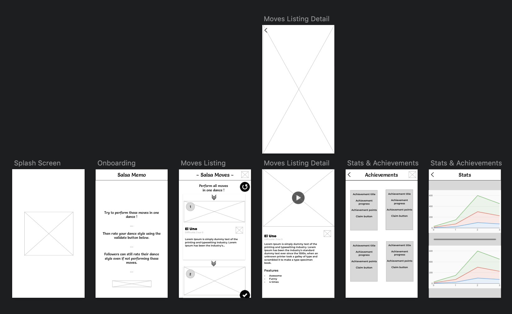
Steps Listing
The main screen of our app will be the Steps listing screen.
Here we have the following UX design goals:
– Ensure that the user knows he has to perform the different moves in the list order: thus we will add some numbering, and some vertical arrows to represent the sequencing.
– On vertical cells, we will display simple visual info as people may already know the move, for more details, the user can select a cell to reach a detailed view where we display the interesting move details for the user: difficulty, detailed description, and a preview video for this move.
As we do not have custom videos at our disposal, we will relay to the YouTube platform for relevant videos of each move (even if not ideal from a UX perspective, the user will be able to find a lot of material to learn the move, and we simplify its learning task by describing it). We will still add a play button to the image as call to action.
We will add the like functionality to the cell design to add a simple personalisation item, for now it will have no effect but this can be used later by presenting the user its favorite moves more often than the others or by having a “library” screen containing all his favorite moves.
Achievements
The Steps Listing is the core component of our app, which will allow us to acquire users, but we need to extend it by adding some gamification to the app to improve the user retention.
For this kind of dance app, one easy element of gamification we can add is user achievements (similar to the Just Dance achievements system).
We display the classic achievement items: title, description, progress, image. (to get a better understanding of how you can program a reusable achievement system applied to a mobile game, you can check out our Clean Achiever project).
To keep things simple, no reward will be given to the user when claiming its achievement reward but it makes the system more rewarding for the user, so we will simply show some visual feedback to the user.
Progress
Keeping track of its progress is a really valuable feature for each user (it is applied in many fitness apps, running apps …).
We will show some stats to the user. To keep the screen consistent, we need a minimum of 2 screens.
We will display two among the most valuable metrics for a dance app user:
– how many dance he has performed each day
– how many stars he has collected each day (performance quality)
For a first version, we will display a per-week view for each stats as it will motivate the user to train regularly and multiple times a week (which is generally an advised training frequency). Each week end, he can inspect his progress over the past week.
User Onboarding
As we know each core feature of our app, the last thing we need to do is to ensure that the user understands the concept of the app, to do so we will begin with the onboarding phase, we have two classic options here:
– A “page-based” onboarding: when the user first launches the app, each core feature is presented in a page and the user can swap between pages.
– An “alert-based” onboarding: similar to the page-based onboarding, when reaching a given screen, the key elements are highlighted.
We will choose the “page-based” option as it is an easy component to reuse and our app does not contain much screens.
We showcase each feature ordered by importance: moves list, moves description, shuffle/validate move sequence, self-rating, achievements, progress. We add a picture under the description of each element.
What’s next?
You can check out the app on the Apple Store & Google Play.
If you are interested in how you can develop this kind of app, you can check out our Salsa Coach project, as always the source code is open sourced while the detailed app design process can be purchased for only $10.
Now that we designed the app screens and the different user interactions, we will discuss the app software development process through an Escape Room app accessible for blind and partially sighted app users!
See more in the last part of this tutorial!
Day 3 to 6 – Developement.